
Spectra Case Study
Project Type:
Solo project completed in 6 weeks as part of the Google UX Certificate Program.
Chosen Prompt: Design an app for a public art museum to promote exhibitions and events and allow patrons to schedule visits.
Problem Discovery:
Many museum apps fail to reflect the vibrancy and creativity of the museums they represent.
Critical Questions:
What makes a museum experience memorable?
How can design create deeper, emotional connections with users?
94% of first impressions are influenced by design, and users form credibility judgements within 50 milliseconds. (Clique Studios)
Competitive Analysis: The Getty
Strengths:
Functional & easy navigation
Clear organization
Offers unique information
Weaknesses:
Visual Design feels generic & uninspired
Does not reflect the richness of the collections
User Interviews:
I conducted five interviews with frequent museum-goers, most of whom were students. I aimed to uncover common patterns in how they engage with museums and museum apps.
I started with two core questions:
What motivates you to visit museums?
What frustrates you about museum apps?
From these conversations, three recurring pain points emerged:
Creativity disconnect
Disorganized navigation
Frustrating ticketing systems
To address those needs, I set three design goals:
Reflect creativity
Streamline navigation
Seamless ticketing
User Flow:

Creating this user flow helped me map out how users interact with the app to complete key tasks. For example, purchasing a ticket might seem straightforward, but mapping out every step allowed me to identify potential friction points.
Wireframes
The wireframes were designed to logically organize content and ensure users could navigate seamlessly through the app. They served as a blueprint for refining the user flow and a foundation for iterative feedback, allowing me to make informed decisions about the layout and hierarchy of information.

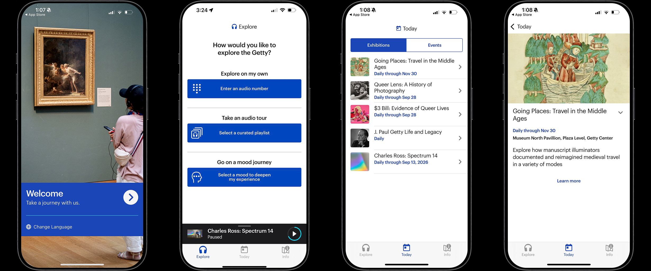
Final Design:

Bold visual identity

Intuitive navigation
Integrated ticketing
What I Would Do Differently:
Looking back, one thing I would do differently is push myself to seek feedback from other designers. Though all of my user feedback was incredibly valuable in understanding the perspective of typical users, I now realize I missed an opportunity to hear from designers who might have provided deeper insights into the app’s design, usability, and visual elements.
Collaborating with designers could have challenged me to think more critically about my design decisions, refine the user experience further, and perhaps uncover solutions I hadn’t considered. In future projects, I’ll make it a priority to incorporate this perspective alongside user feedback.